How user experience design can make or break digital products

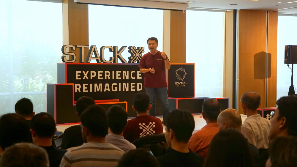
Beyond features and functions, user experience design can make or break digital products or services. Here’s what the experts had to say about the topic at GovTech’s STACK X: Experience Reimagined conference.
On the surface, the world of software engineering and digital service development may seem like one ruled by cold logic and hard code. But simply creating something functional—say, an app that works the way it’s supposed to—is not enough. Experts at the STACK-X: Experience Reimagined conference organised by the Government Technology Agency of Singapore (GovTech) said emotions matter as well when delivering delightful digital services.
Held at the Suntec Singapore Convention and Exhibition Centre on 12 September 2019, the event saw some 200 delegates from across government and industry gather to learn how user experience (UX) design can shape emotions to keep users of digital services coming back for more.
Grab the opportunity
Kicking off the session with an industry practitioner’s point of view was Mr Randy Hunt, Head of Design at Grab. Advocating that “design is learning,” he emphasised that curiosity is needed for good UX design and that organisations ought to have a framework for design strategy and research. At Grab, this framework is what he calls “Total Design”, defined as “a practice of intentionally creating responses by addressing and considering every variable of every touchpoint of an experience”.
This framework resonated with Mr Lim Eyung, director at GovTech and a speaker at the event. He noted that when GovTech begins to develop a digital product, it engages with internal and external stakeholders—and prospective end users—to create a service blueprint to precisely map out every interaction between a citizen (or business) and the government.
“We are a little bit fixated about doing this before even a single code is developed. After that, we go through a few rounds of prototyping and testing, even creating a high-fidelity prototype so that we can better explore the responses of users,” said Mr Lim. This not only helps inform the UX design process, but also highlights back-end requirements that to be fulfilled before a digital product can evoke positive emotions in users, he added.
Mr Keith Oh, head of product design at Carousell, echoed the importance of user-centricity in creating digital solutions. For Carousell, that meant prioritising users’ content on the main page of its app and making the app’s chat function more prominent because that was the main channel of communication among its users. “We also focus on inclusive design, so you will see that we’re using larger fonts, with better contrast and more illustrations,” he said.
Sometimes, the emotional aspect of product design can manifest in an app's visuals and wording. Using the example of a prototype for the extension to the Moments of Life app dealing with end-of-life decisions, Mr Lim explained that the imagery and text associated with end-of-life planning need to be gentle so that users can be encouraged to address a delicate subject.
On this note, Mr Hunt emphasised that a digital product should not be viewed as an end in itself. Rather, the product is a means to change user behaviours and perspectives, which can only be achieved if positive emotions are attached to new ways of doing things.
For example, Grab set out to change how people interface with the transportation network, and it disrupted the status quo by giving commuters access to mobility on demand in a simple and convenient manner. The product was a ride-hailing app with its underlying technology infrastructure, but the ultimate outcome was a shift away from the old way of flagging down a cab by the roadside.
Making it easier to work together
As Grab grows to become a super-app that allows users to do more than just hail a cab—the app now supports food delivery and even hotel bookings as well—it is working with external stakeholders to continue to deliver value to its customers. Likewise, GovTech is forging partnerships across multiple government agencies to better engage with businesses and citizens. Mr Lim mentioned the Inland Revenue Authority of Singapore’s myTax Portal and the Housing Development Board’s Resale Portal as two examples of inter-agency collaboration.
To make it easier for the various government agencies to collaborate, a co-working digital space can be immensely useful, Mr Lim added. At GovTech, this takes the form of the Singapore Government Developer Portal, a content management system for both technical and non-technical users to contribute content.
“We realised that there are many people out there who have insights to contribute, but at the same time, they are not software engineers. They may be people who are very proficient in operations or policies,” said Mr Johnson Koh, principal UX/UI designer at GovTech. “So what we have created is a fast and search engine-friendly portal with a content editor that is more intuitive for non-technical people to use. This reduces the onboarding effort for contributors.”
However, verification protocols are in place to ensure that only appropriate content and features are published. “Users will need to verify that they are from the government (using their government-assigned email addresses), and new content needs to be approved by a dedicated reviewer before it is allowed to go live,” said Mr Koh.
With the Developers’ Portal, Mr Koh is optimistic that people from diverse backgrounds will form communities around the common purpose of delivering new and improved digital services to the masses.
“It takes a lot of time and passion to build and maintain communities,” said Mr Koh. “But there is wisdom in the crowd, and that’s what we would like to leverage moving forward.”


