Product Design Lessons from Google

TL:DR: Product designers should aspire to do more than just developing a usable application. By considering the emotional and psychological needs of end users, product designers can augment user experience (UX) design and change it for the better. Being willing to iterate a product as new insights surface is equally important.
The square-shaped icon that is the ‘save’ button in word processing software once had physical form—the floppy disk. But the youth among us may never have encountered the data storage device that preceded the thumbdrive and CD-ROMs. Similarly, the awkward dial-up tone of a computer connecting to the internet is unrecognizable by the younger generation. Billions of people now access the internet wirelessly.
But the interface between humans and the digital world is changing ever more rapidly. Mr Kishore Kumar, product designer of Google’s mobile payments platform Tez, noted that for the next billion users who are accessing the internet from countries like Mexico, Brazil, Indonesia and the Philippines, the computer is no longer their window to the World Wide Web.
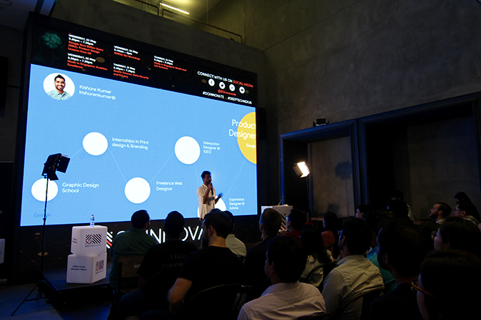
“Unlike us, most of these users have never used a computer before,” said Mr Kumar at the ‘Google Next Billion Users: Product Design Lessons from UX’ seminar presented by SGInnovate in partnership with Google. “Their first internet experience is through a mobile phone, possibly an Android phone because it’s more affordable.”

Going beyond usability
Hailing from India, Mr Kumar began his career as a graphic designer. Employment in design and branding landed him stints at companies like Adobe and Designit before he arrived at Google in 2015, where he became the first designer on the Next Billion Users initiative. The initiative seeks to create UX—an acronym for ‘user experience’—solutions for emerging internet markets.
“We often think about UX as usability. But UX is also about creating experiences for people,” Mr Kumar explained, noting that emotions and psychology are key elements of good UX design.
He revealed that Google adopts design thinking when creating UX interfaces for its applications. This is put into practice during the Google Design Sprint, a brainstorming methodology that typically lasts five days, during which a product team has to think through a problem, assess its possible solutions and emerge with a vetted solution ready to be handed over to design researchers who will then test the product on audiences.
Mr Kumar emphasized that product designers and researchers are not the only stakeholders in the UX design process. Content editors make significant contributions by scrutinising text to make sure that instructions to users are clear and concise. At the same time, engineers are required to deal with the more technical aspects of the product. An interdisciplinary team bringing different perspectives to the table is what matters, he said.
Success by design
For the sceptic, design thinking may be nothing more than a novelty concept. But Mr Kumar has seen the approach bear fruit. As an example, he explained how Google tackled the problem of limited data storage on mobile phones in India.
“33 percent of smartphone users in India run out of data storage space every day,” said Mr Kumar. In response, Google created Files Go, an app which helps Android users locate files and delete them to make space on their phones. But deleting files isn’t necessarily something that makes people feel good.
To put a positive spin on an otherwise negative experience, Google incorporated a blue marshmallow-like cartoon creature into the UX design of its Files Go application. Each time a file is deleted, the virtual critter waves back-and-forth in joy as confetti explodes behind it.
“People are deleting files more often to see this animation,” said Mr Kumar, emphasising how a simple UX design tweak could alter user behaviour and solve a perennial problem.
Iterating with the help of user insights
While the blue marshmallow-like creature was a purely aesthetic feature, Google has devised other UX design elements that are inherently functional. Mr Kumar shared about a feature called ‘cash mode’ in its Tez app that allows two nearby uses to send money to each other without giving up private information. It’s a move that’s geared toward making the user experience of the app mimic cash exchange.
“One of the first things we learned is that you want to modify user behaviours instead of drastically changing them,” said Mr Kumar.
Another important aspect of UX design is walking in the shoes of the end user, Mr Kumar noted. He recalled how a prototype of the ‘cash mode’ function worked great in the Google office, but it went offline when the team took the app to a train station in Kolkata, India. Suffice to say, it was back to the drawing board for the design team.
At the end of the day, Mr Kumar thinks that UX design is an iterative process, and developers should remain flexible as new insights surface. Product designers will also do well to remember that the goal is not to create software, but to craft an experience, he said.
“Users love products that are built specially for them,” Mr Kumar quipped, rounding up the session.


